Lead designer | Design Systems & Operations | Team management & mentoring
CS1: Building a Design Function | CS2: Designing Out the Designer
case study one - building a design function
Seven Years of Brand, Systems, and Creative Leadership at Crown Agents Bank
Company: Crown Agents Bank · Wholesale bank · Cross-border payments · Global markets.
Role: Design team lead
Duration: August 2019 – June 2026. 7 years.
Scope: Brand identity · Design systems · Campaigns · Digital · Motion · Events · Product launches · Investor communications.
- 7 years: Lead Designer
- 5: major brand evolutions led end-to-end
- 70%: reduction in design requests due to self-serve
- 30%: reduction in turnaround time due to design system
- 2: in-house junior designers managed and coached
- 6: agencies and freelancers managed
The context
Crown Agents Bank is a UK-regulated wholesale bank specialising in cross-border payment solutions across global markets — operating in environments where trust, precision, and regulatory credibility are non-negotiable. Its clients include governments, central banks, international development organisations, and institutional partners across Africa, Asia, and beyond.
When I joined in August 2019, the bank had no design function. Creative output was inconsistent, production was slow, and design had no meaningful presence in how the business communicated, sold, or operated. There was no brand system, no asset library, no briefing process, and no shared understanding of what “on brand” meant.
I was brought in as the sole designer shortly after a logo update to pick up where that left off. The scope was wide and the brief open-ended.
01 Foundation
Making design legible to a non-design business
Before I could produce effective materials, I had to establish what various teams and client types needed, plus cement myself, my role, and my expectations across the business.
I began by auditing everything: existing collateral, brand assets, communication templates. Teams had produced varying materials tied to no single source of truth. This presented a credibility risk.
Entering into the building phase, my mandate was to build foundations while simultaneously delivering. I defined the brand’s visual identity, including establishing and stress-testing a revised colour palette, typography, iconography hierarchy, image style, and tone. This resulted in the first generation of brand-compliant assets across every major touchpoint: sales materials, event collateral, digital templates, legal documentation, and external plus internal communications.
At the same time, I built the internal infrastructure: a briefing process, brand documentation, media packs, repositories, and style guide.
In a regulated financial environment, I had to consider much more than just polishing aesthetics, I had to minimise risk and ensure compliance.
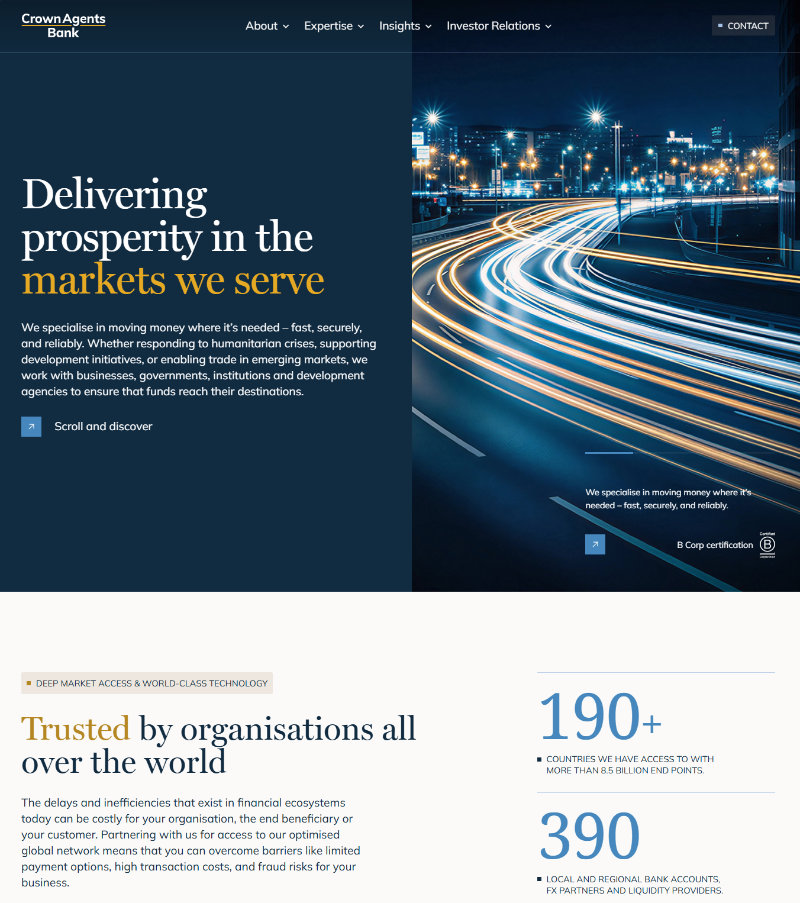
Early inherited materials were very basic, the palette uninspired, and documents inconsistent. The previous logo and assets were deeply embedded with no strategy of systematic replacement with the agency-produced rebrand.
02 expansion
Design as a business asset
The Rebrand
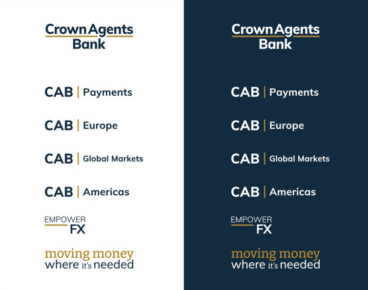
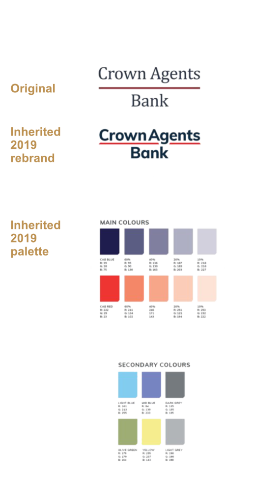
Phase two built on the creative principles that emerged from phase one, resulting in a brand system confident enough to represent a bank whose ambitions had outgrown its original visual identity.
Exhibition Stand
Money 20/20 are defining events for the payments and fintech industry. I treated the brief as a strategic opportunity: the stand would express not just what Crown Agents Bank does, but what it stands for.
After contemplation alongside the 3D renders of the blank stand, I arrived at the concept of using this unique environment to convey layers of our essence – a banking outer layer represented in navy, with a gold inner seam for its humanitarian core (with a word-cloud of the currencies the bank serves). Crown Agents Bank exists to move money where it’s needed – often places other banks refuse. The spatial design created a traversable environment that supported client conversations and sales funnel progression, not just brand visibility.
The response exceeded expectations. After the event, a colleague forwarded this:
“Wanted to share some feedback — speaking with Howard Young, Global Head of Partnerships at Convera. He went to great lengths to explain his appreciation for our stand at Money 20/20, not just the aesthetics but how our coverage was on display and gave the opportunity for visitors to discuss and interact. Those attending would see the size of Convera’s stand and investment — he made sure to show their team what good looks like, pointing them at CAB. Howard has been there for 30 odd years as a sales leader, surviving all the takeovers, Travelex, WUBS and now Convera; knows the FX and payments space as well as anyone.”
A colleague relaying feedback from Howard Young, Global Head of Partnerships, Convera
When one of the most experienced partnership leaders in the payments industry uses your stand to demonstrate excellence to his own team, the brief has been met.
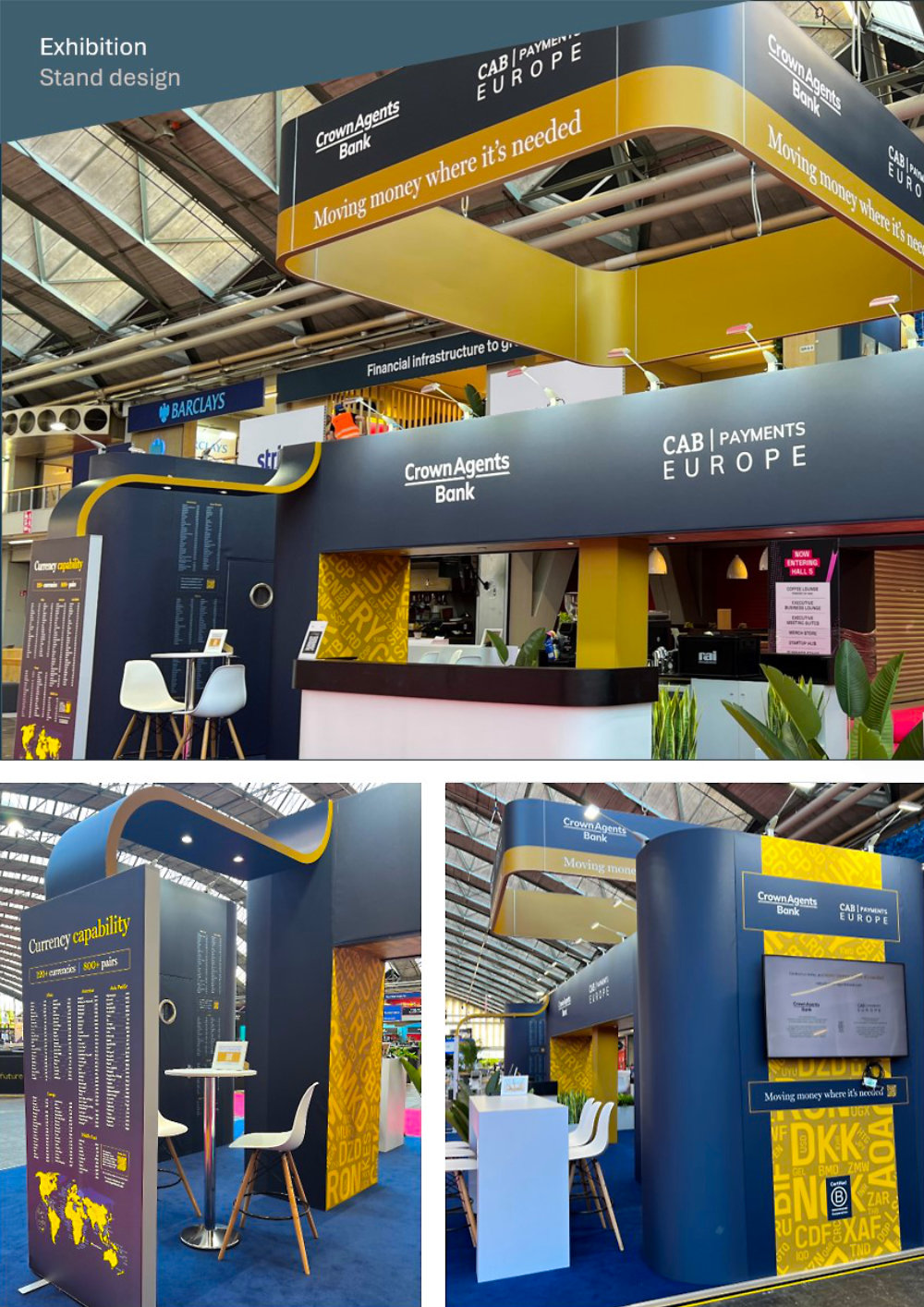
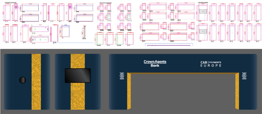
Stand design: financial infrastructure on the outside, humanitarian mission at its core.
Website Redesign
The website project required navigating significant ambiguity: board-level input, a full rebrand in progress (later cancelled just prior to launch), multiple entities to unify, and a development agency to brief, manage, and quality-control simultaneously.
I had to move quickly, despite the abandoned new brand nor the previous one were usable, and before image guidelines or content could be written, I had to deliver change while managing risk and expectations. I created a comprehensive brief, led the agency’s discovery phase, and provided detailed feedback on sitemaps, design ethos, wireframes, and page concepts using Figma. I bridged brand direction and digital experience; ensuring the agency’s technical build was an acceptable brand expansion and anchored in the overarching identity we’d built internally, not generic fintech. I also managed the content creation process in parallel, aligning copy and wireframes so neither blocked the other.
The redesign was well received and immediately rolled out. Using Figma to iterate on UI/UX, in direct dialogue with the agency, confirmed my ability to work fluently at the intersection of brand and digital product.
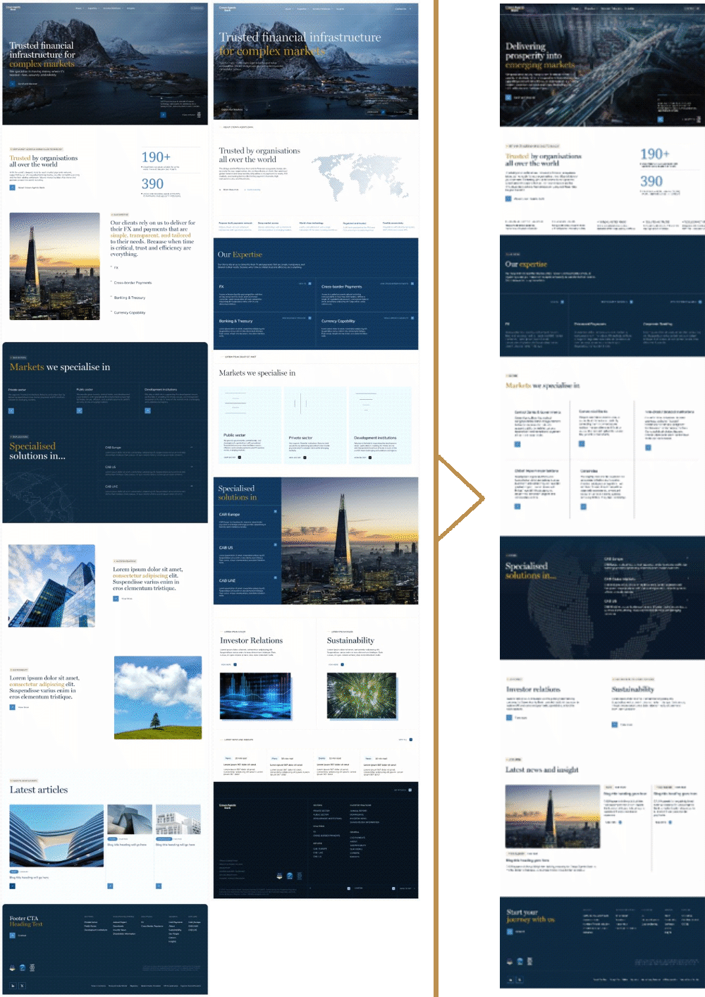
Web design: I provided Figma-based direction and UX iteration throughout the agency’s build process.
Motion and campaign work
I extended the brand into motion; saving money on basic requirements by producing animated content for instructional videos, internal communications, product launches, and digital channels. For more advanced animations I worked with specialists; providing a shot list with script (even recording demo voice recordings to refine timings) so that the animator can storyboard effectively while retaining creative input. Motion is a specialist discipline that many brand designers don’t know how to do or plan.
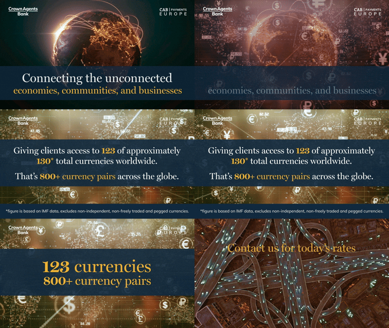
Extended the brand into motion throughout; instructional videos, product launches, and internal communications.
For campaigns I ensured that there were materials to back up further communications, deliver deeper information or progress the sales funnel. Often this would be tailored to a specific audience, so the materials were built with adaptability in mind. The main sales brochure employed a layering system to swap contents without creating multiple working files and was also able to export for print or convert to spreads for digital.
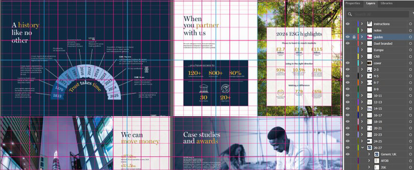
Efficiency: The brochure used a single layered file system to produce multiple sector-specific versions without duplicate artwork
03 maturity
Building what outlasts the designer
The third phase was about scale and legacy. By this point I had enough trust, enough precedent, and enough systemic thinking to build something that would outlast my involvement in any single project.
At this point my manager and junior designers had moved on, so I built a curated network of freelancers and specialist agencies, concentrating on a self-serve and triage strategy to remove the reliance on me. For the first time, I wasn’t the bottleneck. I was the standard.
The self-serve services (such as direct ordering of business cards) and template infrastructure, self-editable pre-built resources reduced design requests by around 70% and saved thousands of pounds in agency fees. At this point I increased my ability to edit our website (WordPress), and created guides for colleagues, to gain more in-house control and further reduce costs. The scalable design system I created reduced my production turnaround by approximately 30%. This system embedded the right creative decisions directly into the tools, so brand consistency wasn’t a matter of individual taste, it was a matter of architecture.
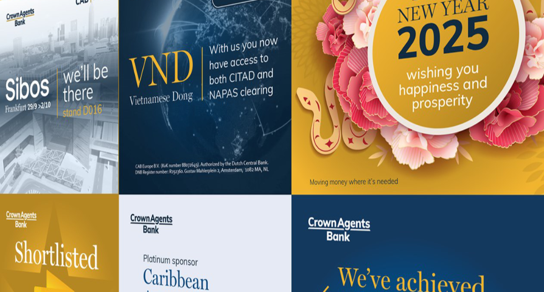
The LinkedIn social asset system illustrates this shift clearly. Previously, new social assets were created ad hoc, each one either created from scratch or referencing only the most recent similar piece, saved in scattered individual files. I consolidated the entire social output into a single structured file. All LinkedIn graphics sorted into groups, assets like logos and staff photos placed, all in one file. The result was a dramatic improvement in visual consistency, a natural evolution pathway for the art direction, and the ability to cross-pollinate successful elements across campaigns without starting from scratch each time. There is significant improvement between the agency-produced 2022 output and my 2026 output, maximising content rather than brand assets, clarity of messaging, increased legibility on mobiles, and using imagery to convey globality.

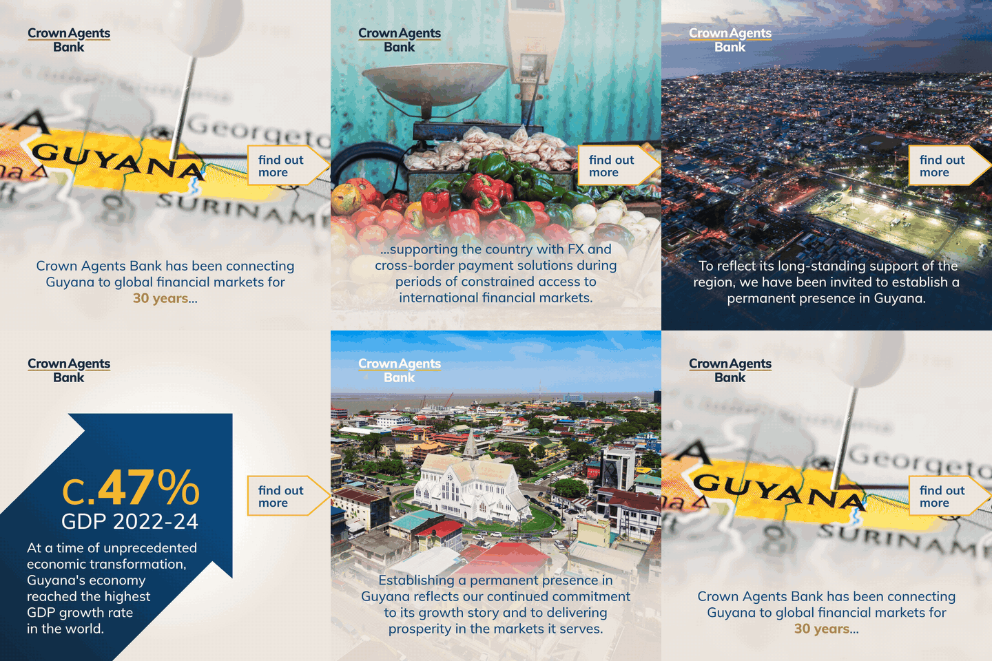
The agency vs. me: Pivoted from the agency’s generic fintech visual language (top) and built a new social identity from scratch (lower), incorporating a clearer brand, highlighting key points, and introducing interactivity.
04 reflection
What building from zero taught me
The most important thing I built at Crown Agents Bank was the infrastructure.
The templates, briefing form, repository of standard editable materials, SharePoint portal, and DAM system, all formed an infrastructure that made everything faster, better, and more consistent. Using pre-approved materials saved our stretched compliance team reviewing every output in full, saved me time designing or managing, and saved money on overflow agency costs. All with minimal impact to the stakeholder as 95% of the work was done.
Building alone also taught me something about prioritisation that I couldn’t have learned any other way. When you’re the only designer, every decision about where to spend your time is a strategic decision. I learned to identify the work with the highest leverage – the asset that would be used a thousand times, the system that would remove the most friction, the standard that would make everything after it easier – and ensure that is done as a priority.
I also learned that design earns influence gradually, by being right in the small moments as much as the big ones. The brief that gets scoped properly. The stakeholder who feels heard. The piece that arrives before the deadline and performs better than expected.
Listening to feedback but also defending choices if my experience is helpful (and learning to explain choices upfront without pretentiousness). Trust compounds. And once you have it, you can lead.
That accumulated trust, and the thinking behind it, is what I bring to a leadership role. Design Directors don’t just make things. They decide what gets made, build the conditions that make everything better, and develop the people who’ll carry it forward.
- 7 years: Lead Designer
- 5: major brand evolutions led end-to-end
- 70%: reduction in design requests due to self-serve
- 30%: reduction in turnaround time due to design system
- 2: in-house junior designers managed and coached
- 6: agencies and freelancers managed
CS1: Building a Design Function | CS2: Designing Out the Designer
Further case studies coming soon
Moving the Needle; Figma; Claude + Design Systems
gallery